There are a few things in particular it’d be appreciated to really focus on.
Main Page - Section 2
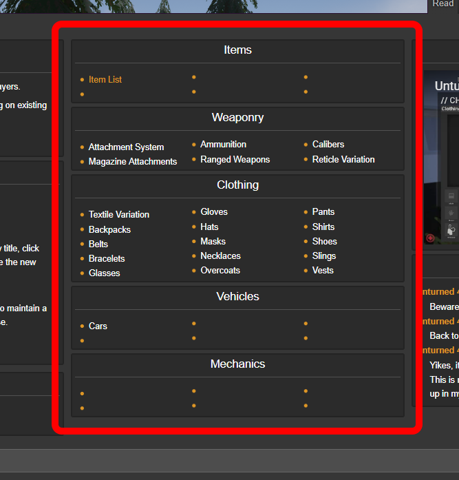
This middle column is Section 2 of the Main Page. It should function in some way as a portal/hub to most of the game’s core content, but as of right now it’s rather bland, uninteresting, and quite lacking. Ideas?
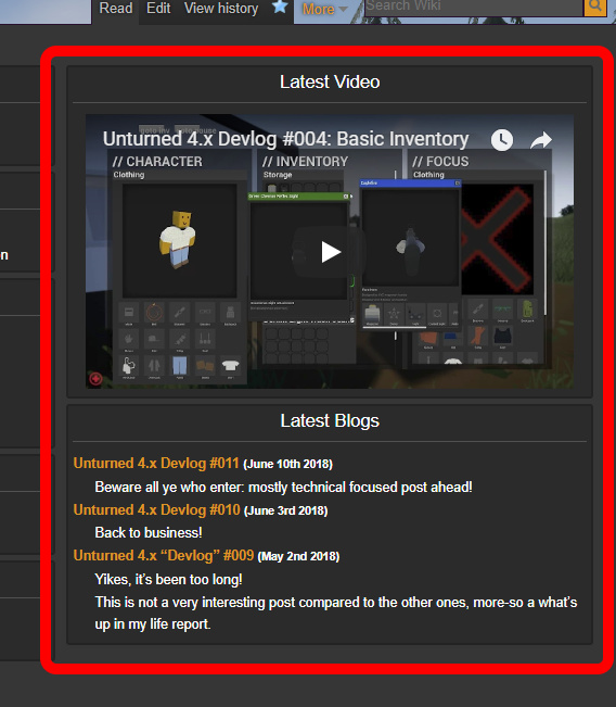
This third column is currently set up to be informational and provide the latest news regarding the game. Keeping it this way would be ideal, but do you believe it could be handled better?
The entire front page, especially section 2, lacks some kind of graphical element to go along with the categories and such, or minimalistic icons or whatever. Perhaps something like the Rust Wikia, etc.
Section 3
Links to official sites and sources of information, such as the 4.x GitHub?
Section 4
Beginners’ guides tend to be too broad to be useful, but there will definitely be a need for server guides in the future. Maybe basic diagnostic guides on FAQs wouldn’t be a bad idea either.
The background is too chaotic, while everything else is basically solid colors, which especially, because of how bright the top of the background is, makes the few things sticking up above the top of the page look really out of place, and the high contrast of the fence against the forest would make the sidebar illegible regardless of whether light or dark text had been chosen. Another factor contributing to the discordant feeling in the top right may be that the tabs, searchbar, and account options are all stuffed in the same area, but are each presented differently.
This was going to be postponed until more changes were made, but most of the other things wanted to be done are dependent on stuff that comes further down the line anyways, so this is being shown now instead, alongside some other recent developments.
The background has been replaced, kinda. I darkened the image, and then blurred it. It should prove to be less distracting, fit in better with the rest of the site’s theme, and help reduce the issues revolving around readability.
The footer area has been wiped out for now. It’ll return eventually, but it wasn’t providing anything of value to the site at that time. Later down the line, relevant pages will be made that will be also be linked from the footer area.
The sidebar has had some changes made to its “Quick Links,” such as removing the low-traffic “Rcon” link that most people would probably never click.
The “Guides” section has been fleshed out with a few more articles, three of which are temporary placeholders for now.
The middle column (“Section 2”) has tweaked. Although it’s currently not realistic for it to receive the improvements I want it to, this new layout removes the obvious bias towards specific item types. At some point the articles linked to from the “Items” section will actually make sense, rather than just being a copy-paste of the removed “Weaponry” and “Clothing” sections.
Part of the middle column’s tweaks includes adding a new “The World” section, although this is subject to change.
The “Latest Blogs” section has been changed to be “Latest News” instead. It will feature anything relevant to Smartly Dressed Games, or Unturned II. Although it will (eventually) contain Unturned II’s patch notes, it will not contain the patch notes of Unturned (version 3).
Moving on to other things that happened in the meanwhile:
Speaking of patches, there is now an article for them. The plan is looking to be to document each patch individually, with this article serving as a hub. Despite it looking like the game will release in 2018, it actually won’t be until 2040 and I was too lazy to fix my mistake.
It’d provide a list of every patch, but not before providing a quicker list of every “major update.” This should help with site load times and page caching, and should be more inline with things like Nelson’s " ‘The X Update’ Card Style" on Trello.
If you’re not interested in the game’s development timeline, maybe you’d enjoy the game’s timeline of events instead?
Obviously, heavy spoilers. A new “Spoiler” ambox has been created to warn you about the dangers of reading.
The page will likely be renamed to “Storyline” in the (near?) future, so that it’s a bit more broad. The timeline of events will still be present on the page, however.
There is now an article for the game’s controls! Although I’m pretty sure the “X Button to Reload” is a complete lie, everything else should be alright.
The template I’m using for the icons is a bit outdated (it’s basically the first thing I did on this wiki), it’ll eventually output higher quality icons for the controllers, and include new icons for things like analog sticks and a mouse. Hopefully. If wiki staff doesn’t make them, I’ll ask Nelson for his when they’re actually done.
At the bottom of the “Controls” article is a new “Tutorial” navbox. It’ll contain all the community guides and official documentation pages, although hub pages like “Modding” will still be useful for any potential overviews and general tips Nelson may end up providing.
All instances of “Rcon” have been replaced with “RCON,” and “Remote Console” now actually links to the page. Huzzah. If you haven’t read Devlog #012 yet, go do that.
The Smartly Dressed Games article received more content. Nelson’s 21st birthday is coming up, in case you forgot!
The page also includes links to various sites. There’s all the official sites (the first four links), the official resources (basically all of the Additional Resources section), and then the subreddit.
The Upcoming Features article was updated a lil’ bit, but it’s basically always updated a lil’ bit more.
Blue is not the default color in that skin. If you want blue, may I suggest a light theme?
It hasn’t been done (yet, but potentially if ever,) because that requires more work to do than the rest of what was done—considering it’s animated, at least 5 separate files, and completely undocumented—and is present on every page for a feature that only applies to a handful editors.