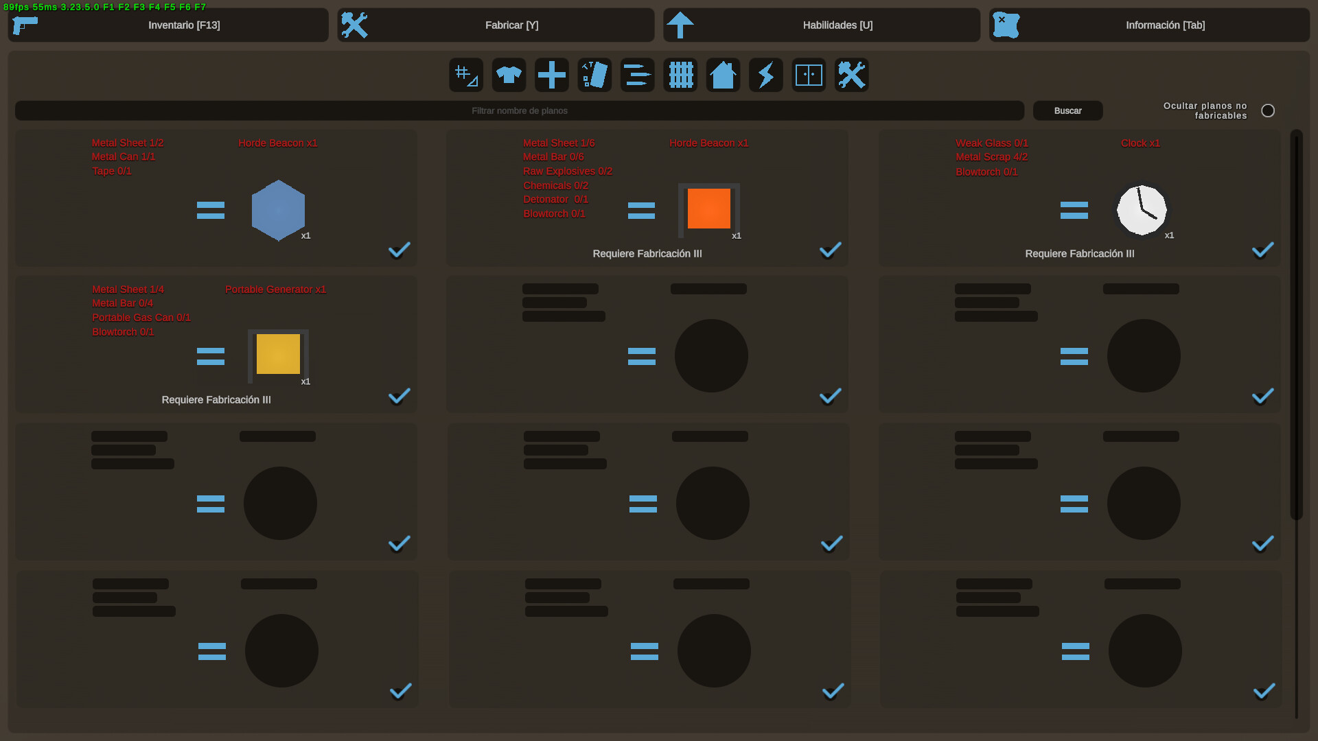
You all know this problematic UI where you have to scroll A LOT just to find something (and the max items you can see on screen is just 4 depending on your screen resolution, but mostly it is on 1920x1080):
To handle this, what about an optional UI (not a new required one) where everything is more clean and small, where you could see up to 12 items on screen? Will be useful mostly for experimented players which already recognize all items on Unturned. Also would be even good for everyone since it takes less space on screen and make the crafting easier
The sizes about UI can be changed ir order to make it better for longer crafteable items, like increasing the vertical size, but the concept is very clear. This could also apply for Skills interface but I have no idea if Nelson will be updating the whole Skills system, so for the meanwhile this interface for Crafting would be good, and again could be just an option on the Option settings, where you can select if you want the Classic or this one (lets call it “Compact”)
Now you could think “hey but what about curated maps including items with larger outputs when salvaging items?”. Well my best solution for that “problem” would be this, so instead of having the item icon at right because that’s what you’ll get after getting all the required items, on this time since you’re salvaging the item you’ll get It’s icon at left and the output at right
i was actually thinking of this recently, the crafting menu rn is really sus especially with the amount of recipes some curated maps have been getting.
my idea was to have even more recipes, but only show the icon of the output item. upon clicking the item, the full recipe would be shown. this’d obviously cause issues with certain recipes like scrapping (all outputs would just be scrap) & multiple output crafts, which is why i like your concept because you manage to fit more recipes but still keep them clear.
i’m pretty sure many map creators have wanted to make larger recipes for crafteable items but they didn’t just for this UI problem. a similar situation happened to me recently on Buak crafting a bulletproof car… it was PAINFUL to see, and this is with a 1080p screen, i don’t want to know how bad this has to be with players with lower screen resolutions
I like this concept, though preferably the input items would also have their icons, just mini. It’s a pretty clear improvement though, there’s a lot of wasted space with current interface.
Oh, that is a good concept. While we’re at it, can we talk about a possible option to favorite crafting recipes, so they would get pinned on top of their category or something?
I agree, many of the new curated maps (half of them being yours), the amount of crafting recipes has been increasing. The compact design is an interesting suggestion, but there are some comments I’d like to make about it:
I personally think that the crafting menu still needs icons. Text based recipes are normally a pain for many players.
Instead of making the crafting recipes into three columns, I think two columns would be enough. Having two columns also still allows item icons to be displayed (if setup properly).