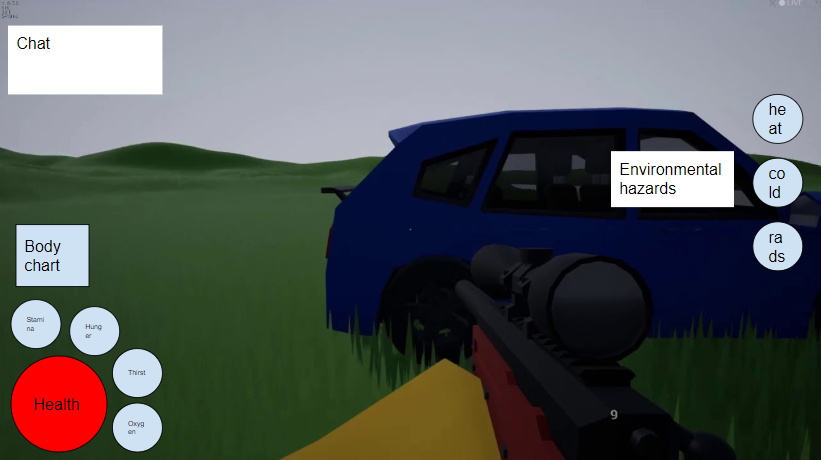
I’ve marked the key points and I will explain the meaning behind each number as follows:
A “The Forest” inspired health/stamina gauge, it may seem inconsistent with the other gauges please don’t mind it
A body chart to show any damage to body/limbs; color coded to mark status
Green being fine; Red being critical
Right arm is critically damaged; broken
Right leg is wounded, medical application recommended
Thirst meter, I originally planned to have it colored yellow to serve as a warning
Wellness will affect any action you perform, your character needs to be taken care of in order to work in top physical condition; I clearly have not
Hunger, self explanatory and gluttonous
Another thing that should be noted, I also thought the status meters for hunger/thirst shouldn’t be visible when they are at an adequate percentage, you can always check how your character is feeling in your menu.
Again the idea presented may have imperfections and inconsistencies but I just want to know what you guys think of this concept
Feel free to also put up your versions, I would like to see other ideas
I think the general health meter should be a little more prominent (as in not sandwiched between health and thirst). I like The Forest, but I was never really a fan of the stamina system, it just feels unintuitive. Per-limb damage is a good concept though.
Changes I would make:
Make the stamina wheel much smaller like the rest of the wheels. A small lightning bolt would work well for the icon.
Make the status wheels either orbit around the limb damage chart, or be stacked to the right. Either way, have them in this order:
Health
Hunger/Thirst
Hunger/Thirst
Stamina.
There also needs to be room for an oxygen wheel.
I like the health and stamina wheels, however there’s no icon to denote that the red one is health and the right one is stamina (this is much more of a problem with stamina).
I’d also like for the blue of the stamina wheel to be replaced with a yellow, just personal preference.
The thirst meter being white also may confuse some, I thought it was oxygen at first glance.
Like what Astro said, I question the placement of the wellness wheel in between health and first. I also don’t think general wellness is one of those wheels that is of enough immediate importance to warrant a space on the HUD
Again, like what Astro mentioned, there is a distinct lack of an oxygen wheel, unless that’s supposed to only appear when underwater or in a vacuum?
I’d also like the body chart to be relocated up a bit more, with the extra space being used to assign visible numerical values on the various meters.
I admit, everything looks sloppy and a bit rushed, i just wanted the idea to be out there, and I appreciate these changes, I think it would be a greater improvement. For matters of the oxygen meter, it would appear when it is being consumed like when you’re underwater or holding breath when looking through a scope, other than that it stays invisible.
I like the realignment And I do agree with the questionable placement of the wellness bar, things were just coming up as I made it(and before you lynch me it was made in 3D Paint so going back to fix would’ve been looong).
For me, I’d use simple lines along the bottom of the screen that would show up whenever oxygen, temperature, or radiation are changing or have reached a critical point. They would appear and flash on screen a bit whenever consumables are used or damage is taken. There could also be ways to manually show them like using the inventory or maybe moving to a lower stance.
I want something simple, nothing fancy or super futuristic. Definitely customizable, 50% opacity and letting you slide the transperency to make it invisible or opaque. Maybe 3.0’s design but sharper edges, and some other tweaks aren’t super major