New Map {Custom gamemode_Deathmatch}

download2

My Rebulid Of My old has just realsed
Its a Close qurters combet map with some of Realsim FPS Settings
https://steamcommunity.com/sharedfiles/filedetails/?edit=true&id=1977787091

It’s recomanded to who wants to play FFP only map

General Changes to the map combare to Untunred Vanlia

  1. Gravity has high weight {-18}
  2. No carfting
  3. No skills ups
  4. No Map
  5. No Water {for optmainzing the map}
  6. Cant break Legs
  7. No Max skills spawns
  8. Guns have double damge than normal
  9. No hitmakers
  10. No Crosshair
  11. No Compass
  12. No team mates are vislble in the map
  13. No team mates HUD name
  14. Can Suicide
  15. Ballistics are On
  16. Instant Respawn
  17. Allow insta kill by Headshots are On
  18. Cant get any EXP by Killing other players
  19. Items dont Get broke
  20. GTA Vice city Thrid person {THIS IS MADE FOR FPP ONLY}
  21. Players can exit any time
  22. Cant make Groups {Might get changed}
  23. Respawn with Items without Rocket mod

Addtional Info
A Server will be hosting this map inless then 24 hrs of this post

5 Likes

“This map is quite something” -Danaby2

1 Like

hello ladies and gentlemen and welcome to yunturned map review

ok so first point i would like to appreciate how much stuff you changed in the config and altered to change the gameplay of the map but i do not understand why the gravity was changed. it’s quite frustrating and i don’t see what it adds to the gameplay.

alright second thing is this glass is hella wonky

i see what you were going for but it dosen’t look too good, with the glass overlaping and missing faces in some areas

use of barricades

u use these ghillie nettings a bunch which are pretty wonky cause they can get destroyed and won’t respawn till a server restart and they can be salvaged by admins/players on singleplayer it’s hella wonky i don’t reccomend

this is like a hella minor thing but u have like stacked newspapers and when u break the bottom one the top ones tend to float

image

some objects are also placed kinda wonkily like there's floating chairs and some clipping

image
stretched blood looks bad


clipping through table

there’s stuff outside the map

stretched (like usually stretching objects is really bad and looks bad pls dont do it)

configuration file

your config also seems to be kinda wonky. (looks like it was done in like the default notepad, i reccomend using notepad++) i don’t seem to spawn with items and after fixing it up a bit i still didnt (spawn tables dont exist, did you forget to upload them with the map?)

the thumbnail could also use some work

the text colors are too saturated and don’t look so good together. it’s better to have big, short clear text smth like this.


also use a low FOV when taking screenshot it just makes everything look good for some reason

the aesthetic of the map is kinda all over the place

so i have a few points to make here

  1. there are a couple objects on the map that are really hecking bright that just stand out and don’t look good (like the bright ass shipping container/barrel and some graffiti)
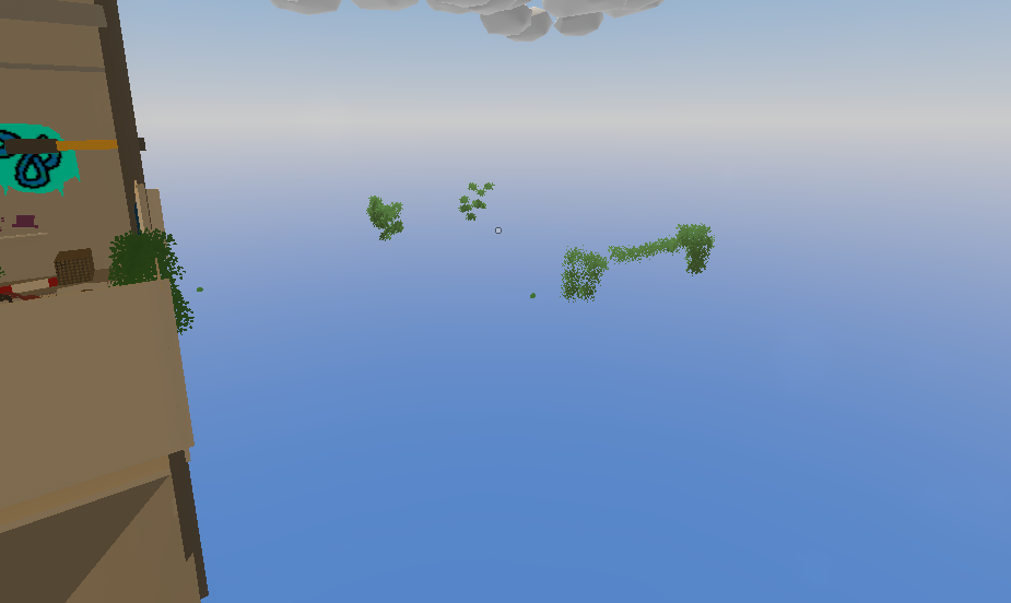
  2. the use of two different bush types dosen’t really work like the two collors dont look well together
  3. greece objects are bright and desaturated which dosen’t fit in with the general aesthetic this map is going for (which i assume is a sort of dark, overgrown spooky bunker)
    i feel like the overal lproblem is there’s a bunch of a objects from many different maps mashed together and it looks sort of weird. of course, this would be solved by adding custom objects but ik not everyone can do that so maybe try to make it so that it only uses assets from one map
    another thign that might help convey the dark aesthetic is lighting, like it looks like u just used default pei ones but it would be nice if maybe you changed the ambience at least
walls behind walls

i don’t undestand why most walls have a second wall behind them idk


like the only thing i can think of is not being able to peek through walls in 3rd person but u can still do it

@SirAdy unleashed also would like to complain about the lack of a sir ady unleashed graffetus

Too Long ; Didn’t Read : I can see that the author attempted to intreguing gameplay through the changes made to the configuration file and item spawns (that, unfortunately, do not work). However, I feel like the biggest flaw here is the overall aesthetic of the map which could be fixed by creating custom objects but I do understand that not everyone can do that. I reccomend playing around with the lighting and making sure you use objects that don’t conflict with eachother.

13 Likes

can we get a tldr too that tldr it’s to long so i didn’t read

3 Likes

host a monthly (or even weekly) map review

it would be a genuinely good review series

legit map review by danaby2

1 Like

yeah ive started doing that, the first episode is out now on youtube ! https://www.youtube.com/watch?v=85Gup9qhqJo

8 Likes

Danaby you sound different

4 Likes

yeah im a bit sick *cough cough

6 Likes

Let me just update it with more grafiti in a Sec

1 Like

eh no thanks

1 Like

I know this is late to say , but I WASNT TALKING TO YOU
also now the map do have the Sirday Decal from Danaby2 Custom Gradti mod since Sirday asked for it

1 Like

This topic was automatically closed 28 days after the last reply. New replies are no longer allowed.