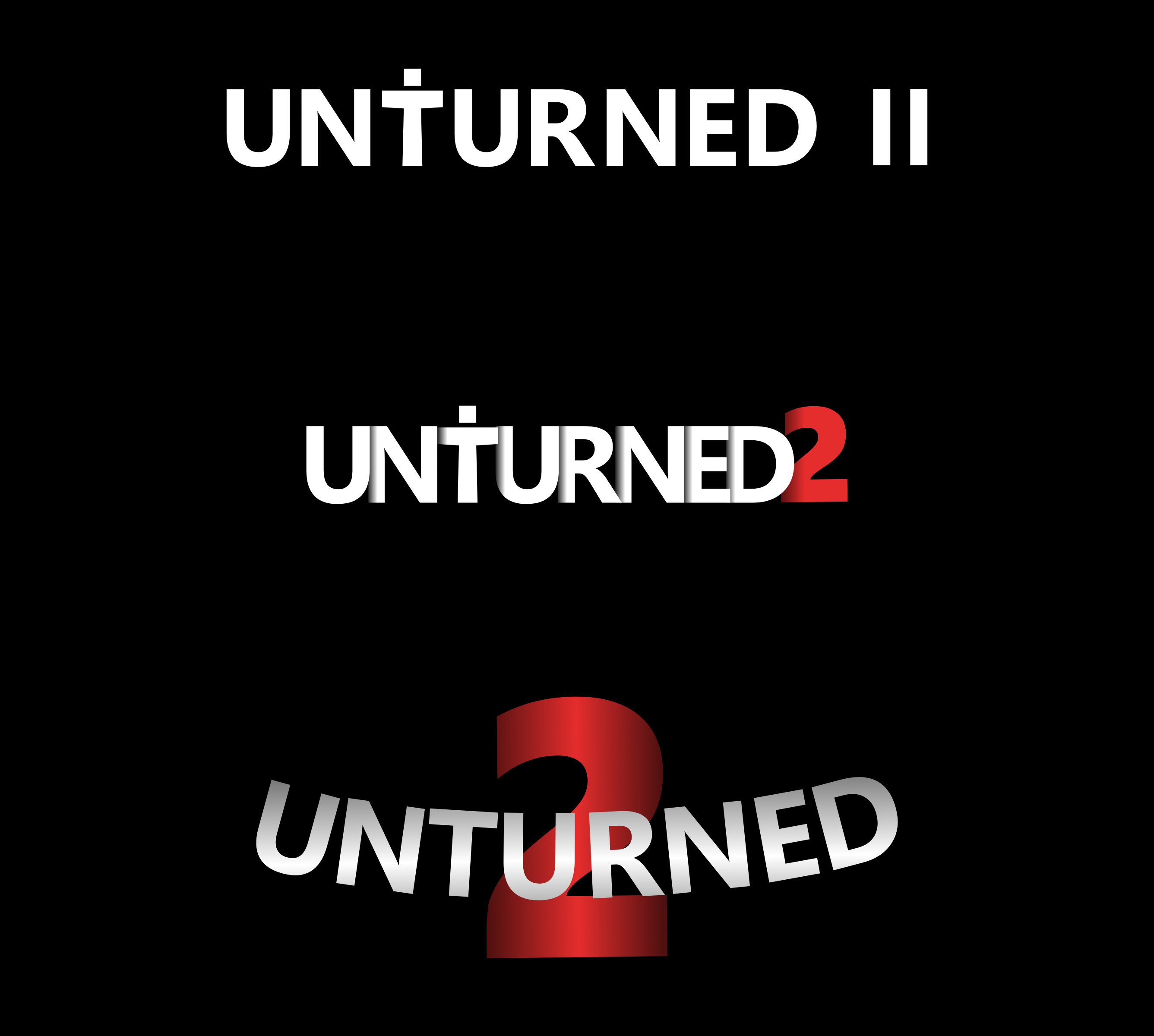
Unturned 4.x, or Unturned II has new shaders, more detailed models, and a changed style all-together. As a Graphics Artist, I created 3 concept art directions for how I believe the logo of Unturned II should be.
Top: 1
Middle: 2
Bottom: 3
Now some of these I saw inspiration from other concept art posts. Nothing is 100% original.
I thought because of the new shaders, models, etc Nelson shouldn’t have the same style logo as 3.0. (the player with the ace shooting at zombies) so that’s why I didn’t make one of those.
The T being a tposing player looks pretty childish to be honest and doesn’t look very good, and number 3 looks like microsoft word art. If you removed the tposing dude and just put a normal T number one would look better though. I agree that silhouetted action shots look good on text, things like tarkov as previously mentioned or dayz.
I don’t consider the desktop wallpaper the logo. This is what I’d consider Unturned 3’s logo, if we’re leaving out the zombie face as an option:
That’s what’s used for its Store page on Steam. Most of the time, the “logo” used is just this text (with or without the Free to Play part). The wallpaper is just vanity. “Unturned” in Arial Narrow (or whatever variant it is) would be the logo, alongside the zombie face.
I would personally recommend only using the Roman numerals “II” rather than “2”. There’s already an “Unturned 2.” The reason its called Unturned II to begin with is so it’s not confused with Unturned 2.
I like the 2nd version. I’d like to switch to Roman “II” and make it more weathered out. And ditch the t-pose thing.
You can probably go for a roadsign-esque logo with rust and chipped paint on it, sounds like it’s worth an experiment.
Extremely late but I kinda wanted to talk about it.
The first logo was the best among all 3. The T-pose thingy is a litle bit cringy though. It didn’t tried too hard to look good. But not too basic. As joker have stated. “Changed to roman ‘II’ and use the red color.” And this would be spotted on in my opinion.
The second one isn’t so bad. There’s clearly a usage of shadows (or shaders. Idk.) But it’s tried way too hard.
The last one is weird. The gradient kinda ruined the logo and it’s kinda reminds me of the simcity 4’s logo… kinda belongs to the movie poster imo.
Personally, I’d use the first logo. Remove the T-pose. Added a little bit of blood splatter at the bottom and maybe a little bit of overgrowth grasses ontop and vines at the corners. Not too much though.