Many people has created some concepts, but none of them were really creative. There should be an element, something relevant in Unturned. One examlpe is the past versions, where there was a zombie, but with the vector faces, it wouldn’t look so nice as before. Any ideas for what it should look like? From there I can create some concepts.
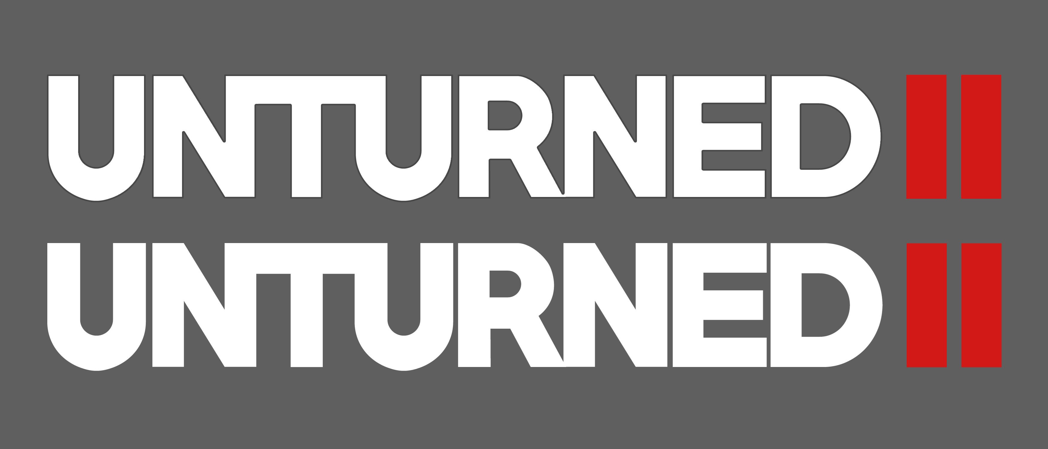
Well a U would be too basic. Maybe a player face? Honestly I don’t know. But the logo should be easily recognizable.
Yeah, but the player face is too simple, it doesn’t have anymore that pixelated charm.
That’s why I think there should be aa relevant element from Unturned II.

mind if i try to use your logo’s design to make something similar? or atleast try
Edit: I came up with two styles but i sadly couldnt exactly nail down the style you wanted 

2nd edit i took the images off Google the original links to em are here if you want to check em
https://www.deviantart.com/joakimolofsson/art/Abandoned-City-277271104
forest one was a yt thumbnail so i couldnt find it out
12 Likes
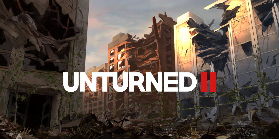
I really like the first one
1 Like
I really liked the first one shown by @RedCo then I made a change in the font of the letters.

21 Likes
I made the first one you’re talking about, and by the way, your version looks much cooler! What font have you used?
1 Like
I get the feeling a “cleaner” looking font might be more suited.
1 Like
What if…

Some much better ones you guys have made in here. 
56 Likes
The font should be purple, then we’re talking.

17 Likes
Try adding a picture of a more damaged part of pineridge, and change the font to a more “apocalyptic type??” then it will be perfect.
I just realised how stupidly a lot of things are named. Prince Edward Island, Brigham City, salt Lake city, New York, Bridgerland, 711, common cents, peach city, pizza hut,
I’m s-
Wow, we all thank you for the compliment.
Comic sans?
Nah, it needs to be Times New Roman.
1 Like
Redcomm… You said… Sans…
OPPORTUNITIES AWAIT US
2 Likes
*RedComm
The escape from tarkov one looks nice but doesn’t really fit the vibe IMO.
that better not be comic sans
2 Likes