Still waiting for any form of preview artwork here…


Still waiting for any form of preview artwork here…
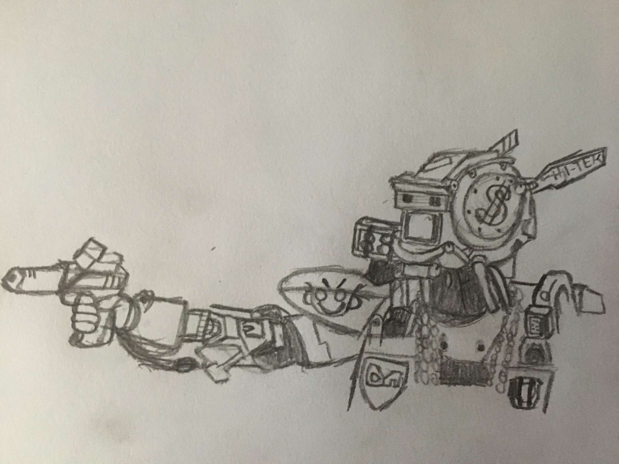
I uploaded a photo of concept art I made.
Can ye draw it in the computer tho.
Black and white is nice. But in colour would be nicer imo.
Also as molt said. As long as it’s considered as a “fanart” and that it’s not for commercial use. You’re good to go.
If Unturned has a Webcomic, it should have that colorful and simplistic manga style with less weebish features. I really like the concept art of this future web comic. It looks like the character is wearing a Military shirt/jacket, Outfit jeans, black travel pack, whit bandana and no vest. I like it.
No No No No No No No No No No No No No No No No No No No No No No No No No No No No No No No No No No `いいえ!
Artwork is cool imo, I like it 
I was thinking something more like the original game style like this
this is more for reference to what I would like to see I just woke up so I’m still a bit tired my art is usually better like thisbut anyway it was more for reference like stubby feet and arms and a square head so you can see it is unturnedI disagree. Making it that simple and blocky really makes it look like something for 9 years old kids, the prototype OP showd is more then ok imo.
I mean at the end its a comic book of the game so it should have some freedome in terms of style, just look other examples like idk resident evil (the first game) comic book, the style there does not have some low poly graphic style but instead its kinda detailed. I think that this way of handling it is cool.
I meant that you could still see that it is unturned of course i don’t want it to be this exact style.
Not only is the comic book conforming to styles that were popular during that time, but “low-poly” isn’t how you define Resident Evil games. They were always meant to be interpreted as realistic. They did not choose to portray the characters as “low-poly,” it was forced on them due to technical limitations.
I personally find the ones for “9 year old kids” okay, imo.
This one is alright, has some shading, and is in style. It’s not the way I’d take it, but it’s not trash.
Unlike this one and this one, which are in style but low quality.
I also think of the artwork with the Mega Zombie towering over a player, which isn’t bad by any means.
The solution to it not looking bad is to just “be good at art.” Understand artistic principles.
The first example you linked is in fact pretty nice, but that doesn’t automatically make OP’s version bad or not fitting at all.
Art is about tastes, about what fealings it gives to those observing so there is nothing to “learn” about it, it’s not math.
You’re right, it doesn’t make OP’s own art bad.
However, OP hasn’t provided any additional work as of yet either. Just a pencil & paper concept sketch.
This topic was automatically closed 28 days after the last reply. New replies are no longer allowed.


