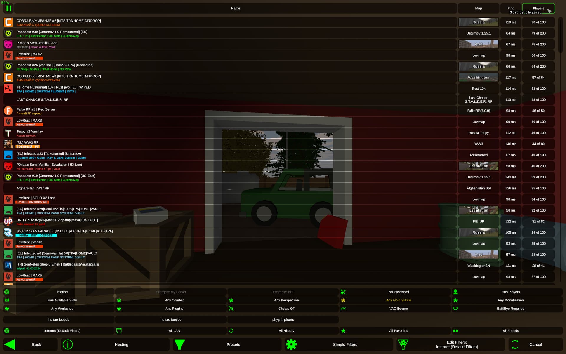
It’s been a good couple months since it’s been updated and whenever I play this game with people I still occasionally hear someone being confused by the new layout. To quote one of my polish friends, trying to use the server browser to play right after escalation came out, “co to kurwa jest?”
From talking to people about this, it comes down to the “presets” being too general to be usable, and “simple filters” not being simple enough to understand (there’s 15 of them, it’s just overwhelming!). The way most people seem to have configured their browser (both now and even before the changes) is to have the least restrictive filters, and only use specific ones to find a server e.g. Map name, server name, etc.
One thing I commonly hear from people is that they’re fine with the browser because they “have learned to use it over time”. Opinion: the browser should not take any time to learn. It should just work. (See: rust server browser, ark server browser, etc)
What changed - Bigger preset buttons, smaller “other” buttons
Justification - Most players want to find a server when using the server browser. The tools that allow them to do so, should be emphasised over things that don’t help them find a server, such as “Hosting”, “Back”, etc.
Change 2:
What changed - Important filters ripped out of “Simple” Filters
Justification - In the default configuration, the browser now just works. Some filters (map/server name, but perhaps also “PVE”, “workshop”, “perspective”?) are a lot more useful than others (“gold servers”, “monetisation”, “vac”, “battleye”) and as such should be easily usable without showing all of the less useful filters (perhaps renamed to “advanced filters”, which will show the remaining options)
Change 3:
What changed - Rename default presets omit the word “All”
Justification - What does “All LAN” even mean???
Change 4:
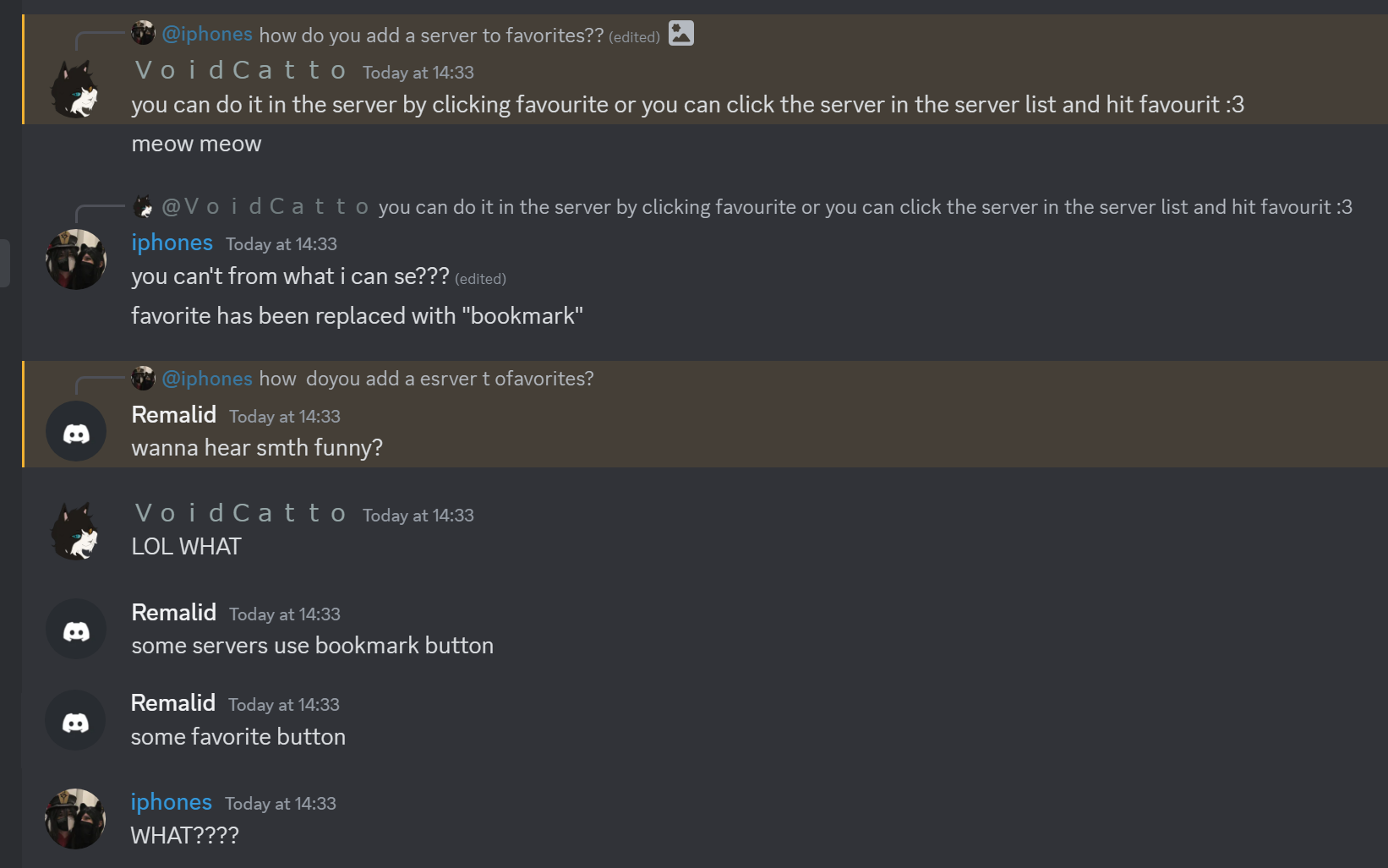
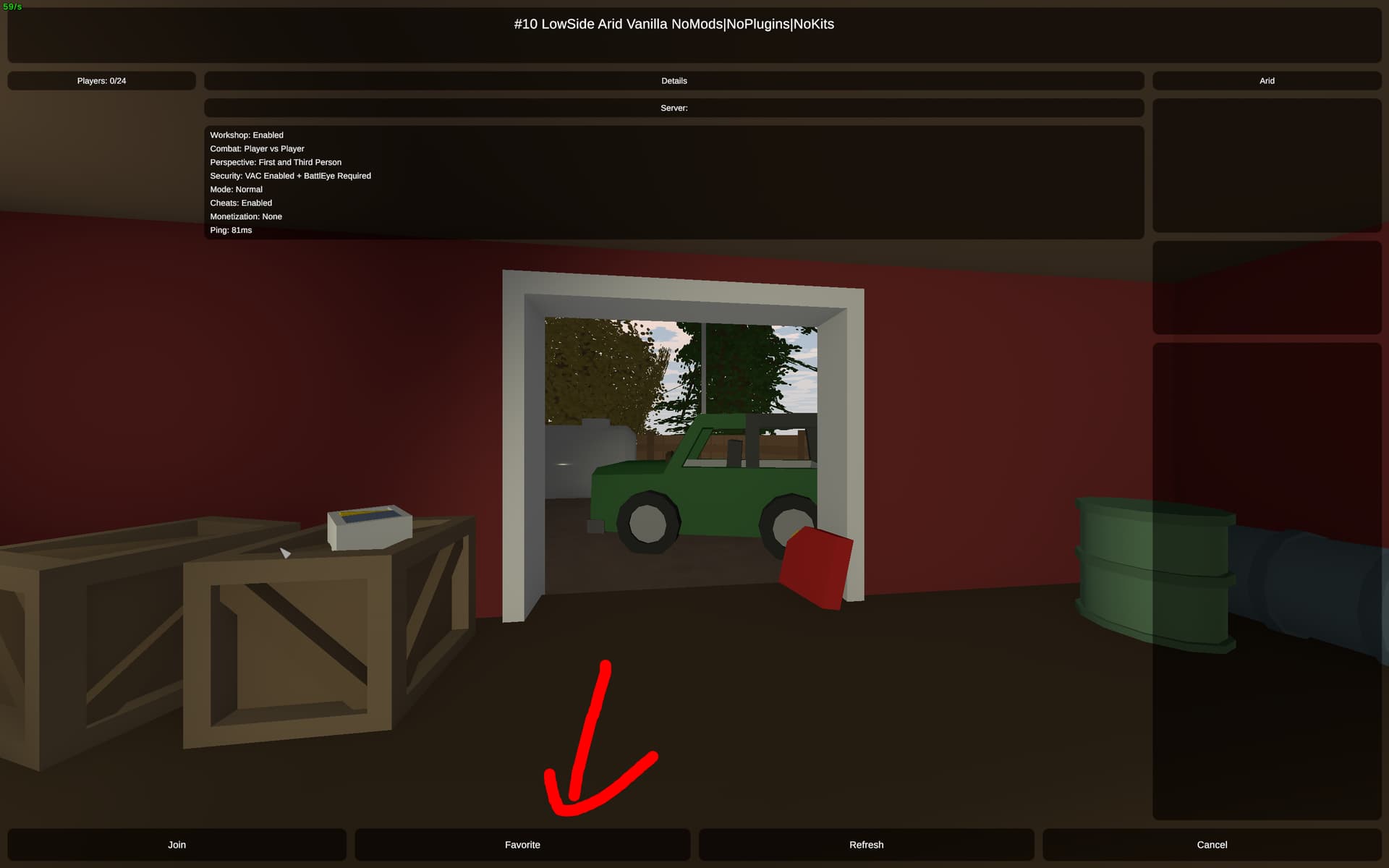
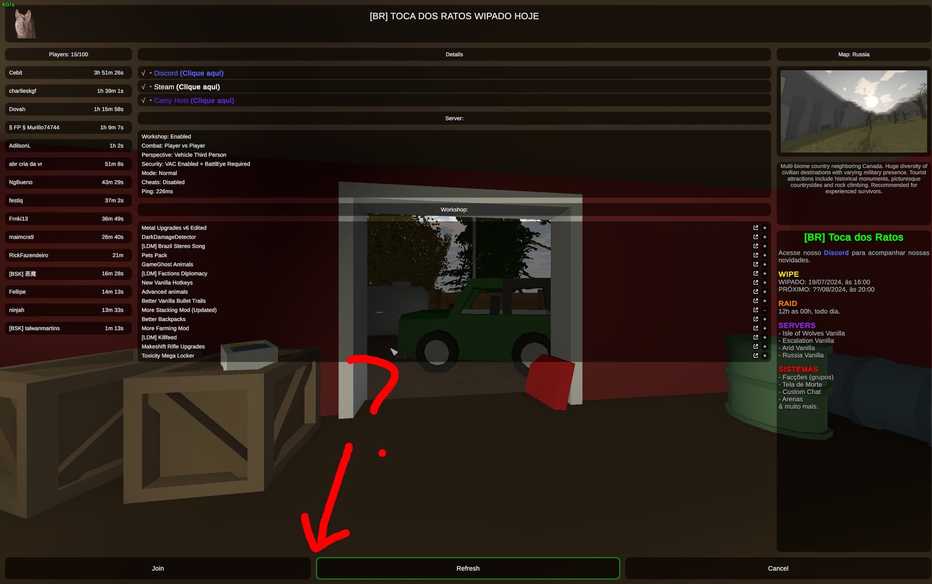
What changed - Removal of Favorites tab
Justification - Bookmarks have replaced them! Or so i thought…
What is going on with bookmarks???
I added a server to bookmarks yesterday and thought it was a really good system. I liked how the servers all show up under a seperate menu with no clutter (although it would be nice to at least have the map name and player count listed), allowing me to rejoin at will. It also made me realise that the “All Favorites” preset is now useless because the favorites have been replaced by bookmarks.
As an end user the distinction between these is really unclear and further complicates the process of actually playing the game, especially for a new player.
Polls
I would like to evaluate the strengths and weaknesses of the current server browser, as well as my concept.
1. How often do you create & use custom presets?
Regularly
Rarely/Once, to try it out
Never
0voters
2. Which server filters do you use often enough that you think they should be shown outside "advanced filters"? (multiple choice)
Server Name
Map Name
Combat (PVP/PVE)
Perspective
Workshop
Plugins
Other (comment!)
None
0voters
3. Currently, when using the server browser, how often do you have "Simple Filters" enabled.
Always
Sometimes
Never
0voters
4. Do you (as a player) understand why some servers use favorites, others use bookmarks, some neither and some both?
Yes (if yes, reply to this post with the answer, ideally spoilered)
No
0voters
5. Do you think the current "Internet (Default Filters)" preset is too restrictive as opposed to the other default presets (e.g. "All Friends") which show everything? It currently hides empty/full servers, servers with cheats, servers with no vac/battleye, passworded servers.
Yes, it should show everything!
Partially, some of those filters could be changed.
No, it’s fine the way it is.
0voters
6. Do you think the current browser is confusing to new players?
Yes, it should be improved / old one was better11!1!!
No, it’s perfect the way it is.
0voters
Opinions
If you have anything to add, please reply to this post with your thoughts and personal experience.
To help clarify about bookmarks vs favorites (covered in more depth in the documentation):
Steam’s built-in favorites and history lists are incompatible with Fake IP, so the favorite button is unavailable when Fake IP is enabled.
The bookmark button is available if the host has configured the BookmarkHost config. It’s somewhat of a work-in-progress but needed something sooner than later in response to concern from hosts about the lack of favorite support with Fake IP.
Ideally, the client already has a perfect “bookmark” in the form of a server’s persistent Steam ID, but querying any details from this would require temporarily opening a SNS connection on the game port. This adds more load to the game server and hasn’t been implemented (yet?), but would improve the join-by-server-code experience, and is something I’d like to do eventually.
Some PVE servers enter PVP mode even if you filter out PVP.Many servers, even after filtering, will completely change the mode of the things added inside the server, making the filtering mode ineffective for some servers,There are still servers without monetary content, some of which will prompt purchase permissions when added. The biggest problem with servers currently is that the filtering function is ineffective for some servers due to lax management, which greatly reduces the gaming experience for players
If a server has configured their monetization field, but has done so in a way that’s misleading (e.g., setting it to “None” despite having microtransactions), they can be reported via a support ticket.
If you’ve encountered a server that’s showing up despite not meeting your search filters (e.g., PvE servers while filtering for PvP), would you mind creating a support ticket?
I already made a post with a whole re-do of the re-do of the server browsers with a combination of the new design and the old design, including how it would look from the average player view, or with all the options opened and more, everything explaining about why it would be like that and how it would work with the rest of the own interface buttons and more. But hey I’m not called Denaxon or Ranaby so everyone seems to ignore it
Since the new design everything became way more confusing and some of my friends always says they don’t get it now (even today). Including 83918 options doesn’t make it be better, it needs to be clean with an easy and fast look
To save you time reading my old post, this is how it would look when you’re changing filters and probably adding presets, including all the possible columns (or basically this is the most “confusing look” you could get)
But this would be the average player view, with just the list of the default presets, those few columns and the filters being hidden, so if you want to use the default Internet preset the server list will go down completely normal to scroll
Edit: I do like your version, the presets being on the left hand side of the browser is nice, its also something we included in our old concept - it does a lot to reduce the empty space in the centre of the screen as well as seperating the presets visually from everything else rather than just drowning them in a sea of buttons. I wish we had gotten it in the original overhaul
I am very supportive and will provide a support ticket. Players play games to gain happiness through the game, rather than being filtered out like April Fool’s Day with various inconsistencies and pranks. PVE will kill random guns if they enter, which is not a so-called surprise