in the past there was a post about the Unturned II logo and they had very good things, but I feel like this was something to appear on the loading screen and on the steam page or on the game page itself, but what should be the thumbnail of the job? now it’s the face of the zombies, send their creations.
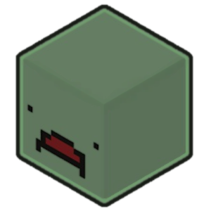
Current logo of Unturned 3.0
1 Like
Pork
January 5, 2019, 3:27am
3
Besides the fact that it’s uneven, I don’t see an issue with that, it looks pretty nice imo.
very nice, uneven might trigger some OCD. good concept. little changes and it would make it perfect
mão de bosta.png
image title checks out I’d personally have the same zombie head (but on UII’s style ofc) or the denizen’s head, both in 3D.
I would like to see the intention of the post is to see everyone’s idea
Syero
January 5, 2019, 3:16pm
8
this reminds me of rust, maybe change the color scheme? this game is pretty much the free verison of it
RedCo
January 5, 2019, 3:49pm
9
I think anonim just took my edit of this logo:
I rather like it, very minimalistic yet clean, though it is my fault that the II doesn’e line up with the U.
1 Like
In vdd I made 0 is my fault II did not align his logo was that I liked it and I was inspired The fonts of the letters are different
FlodotelitoKifo:
denizen’
isnt that what the bandit npcs are called? or are you referring to the player.
If so, then that wouldnt work, as they will have different faces to each other. It would work out better if it was the classic zombie face, whether its used ingame or not.
If your curious about a background topic, check here,
So I was listeing to the Germany Trailer music, and came across an idea when watching it. As the video progressed, the background was showing pictures of the map. As seen here:
My idea is that as you load into the map, instead of still pictures, it shows previews of the map slowly changing to another picture of the map. I’m open to hear your thoughts and opinions Down below
Aj_Gaming:
FlodotelitoKifo:
denizen’
isnt that what the bandit npcs are called? or are you referring to the player.
If so, then that wouldnt work, as they will have different faces to each other. It would work out better if it was the classic zombie face, whether its used ingame or not.
“The human survivors are called Denizens, if only in the code (4) to distinguish them from other types of characters and players.”—Modding/Denizen setup
2 Likes
F1
January 5, 2019, 9:42pm
15
Hmmm…I dunno,looks a little bit too fancy for Unturned imo.
F1:
too fancy
It’s 3 letters
and not even in the optimal shape for a desktop logo >:c (my personal gripe with it)
Get outta here with that “too fancy” baloney!
2 Likes
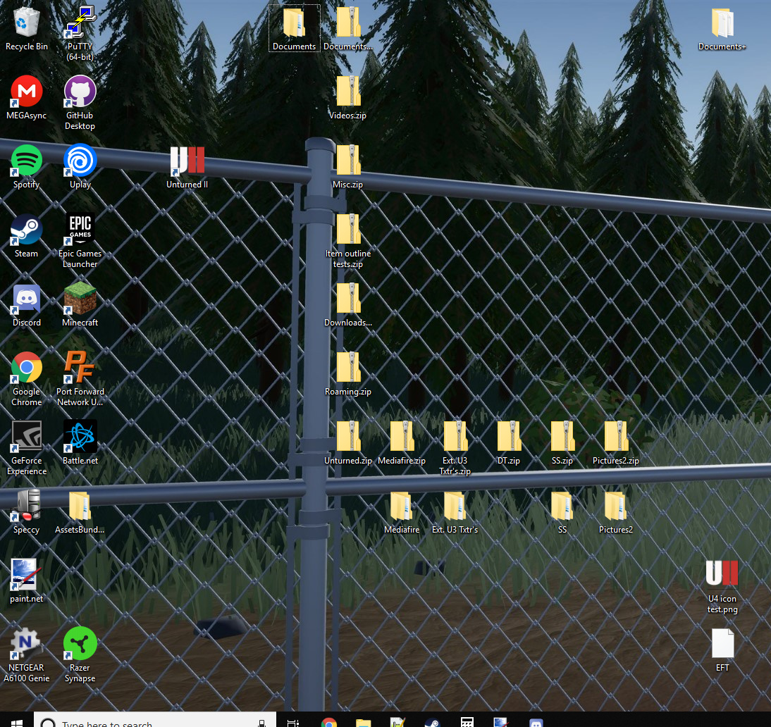
Addendum:
Here you can see the proposed design with some other icons. It looks out of place. Definitely needs some revisions if that’s the design people like.
It looks especially narrow, at the very least.
1 Like
I dont know, I really do think that the logo should be the face of a turned, its classic
RedCo
January 6, 2019, 12:22am
19
What could also be done is have the “II” be the bars on the “U.” Might be a bit confusing, but it could work.
Maybe, but if it’s confusing even if it does work then the UII idea should just be scrapped at that point.
Until U4 gets an official Desktop icon, I’m just going to use this to differentiate it from U3:
1 Like